Blazor Pivot Grid
The Blazor PivotGrid component is a lightweight and powerful data visualization component. It offers many advanced features and is highly customizable to different needs.
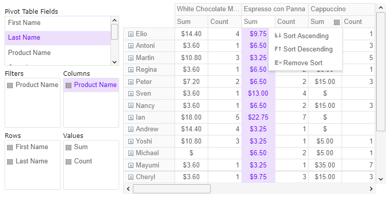
The blazor pivot grid allows visualization of multi-dimensional data and hierarchical data structures. It supports multiple different aggregation functions and developers can also provide user-defined aggregations. The pivot grid for Blazor also ships with a pivot table designer widget. The pivot table designer allows you to visually configure the pivot columns, rows, aggregated values and multiple different settings. You can also configure pivot rows and columns text alignment settings and various text formatting options on the pivot cells. The Blazor pivot grid and the pivot designer also allow the user to configure pivot table filters both programmatically and visually using drag and drop operations and filter selection options. You can use the PivotGrid widget to add interactive pivot tables to your website, build custom dashboards, or use it in your mobile applications. The pivot grid widget offers excellent cross-browser compatibility and works well with both desktop and mobile browsers.
Basic concepts
Before you start with the Pivot Grid widget, you should be familiar with pivot tables and understand when to use regular data grids to display table data, and when to switch to the pivot grid and pivot tables. The following article is a good entry-level introduction to pivot tables: Wikipedia: Pivot tablesGenerally the pivot grid will contain the following elements:
- Pivot Rows - the unique values of the source columns which form the rows hierarchy.
- Pivot Columns - the unique values of the source columns which form the rows hierarchy
- Pivot Values - the aggregation funciton headers. They can be displayed below the columns or on the right side of the rows.
- Pivot Cells - each pivot cell contains the aggregated value for the respective row, column and aggregation function.