Blazor NavigationBar UI Component
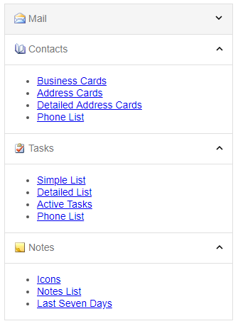
The NavigationBar for Blazor is a vertical list of expandable items. When you expand an item the content of the item is displayed either below or above the bar with the item. The component supports single or multiple expanded items. To switch between the two modes, you need to change the property 'expandMode'. By default, the NavigationBar can have only one expanded item (like Accordion). If the 'expandMode' property value is 'multiple', users can expand or collapse multiple items at the same time.