Blazor Grid
Blazor Data Grid component for Enterprise Apps. jQWidgets Grid for Microsoft Blazor is a professional datagrid component built with Typescript, Blazor and the jQWidgets framework. It offers hundreds of features like sorting, filtering, grouping, master-detail views, paging and more. It also ships with many advanced capabilities like drag and drop, columns resize, printing, data export, aggregates, RTL support and more. The Blazor data grid is a perfect solution for enterprise applications built with the Microsoft Blazor UI framework. It supports native Blazor features like AOT compilation, declarative configuration, TypeScript compile-time checking and more.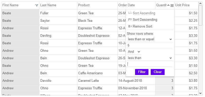
The jQWidgets Blazor Data Grid component offers top performance and responsive, fluid design. It offers easy to use and well documented APIs. The jQWidgets framework ships with over ready to use 1000 Blazor examples. Like all widgets in the jQWidgets framework the Blazor Grid component works across a range of devices and offers responsive, device-optimized look and behavior on PCs, tablets and mobile phones. jQWidgets Grid for Microsoft Blazor is trusted by thousands of companies and big user community. We offer excellent techinical support and customization services. The jQWidgets framework releases frquent updates with continuous improvements.
You can use the Blazor Data Grid component either with Javascript or Typescript. For modern browsers, we suggest using it with Typescript. The Microsoft Blazor Grid component and Typescript definitions can be found in the download package, within the jqwidgets-ts folder. The Blazor_jqxgrid.ts file contains the Blazor6 Grid component implementation. The jqwidgets.d.ts file contains the Typescript definitions.
Data Binding in Blazor Grid
The data grid component has built-in data binding capabilities and supports client and server-side paging. It can be bound to Local Data, JSON, XML, CSV, TSV, Remote Data (JSONP) and Virtual Data. In order to bind the Grid to a data source you need to set its source property to point to an instance of jqxDataAdapter.Sorting in Blazor Grid
Microsoft Blazor applications using the data grid component can benefit from advanced filtering (including custom filters), and sorting capabilities. The grid sorting is customizable and can be enabled or disabled. The data in the grid can be sorted from the UI by clicking on a column or using a context menu button, as well as programmatically via the APIs of the Blazor grid. The default behavior of the sorting function is to apply ascending or descending sort depending values in each column. The grid's API also allow developers to extend and customize the sorting with custom sort and compare functions.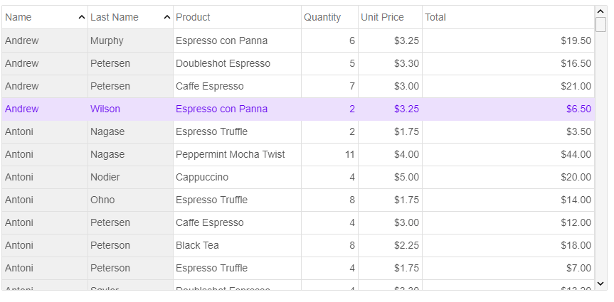
Filtering in Blazor Grid
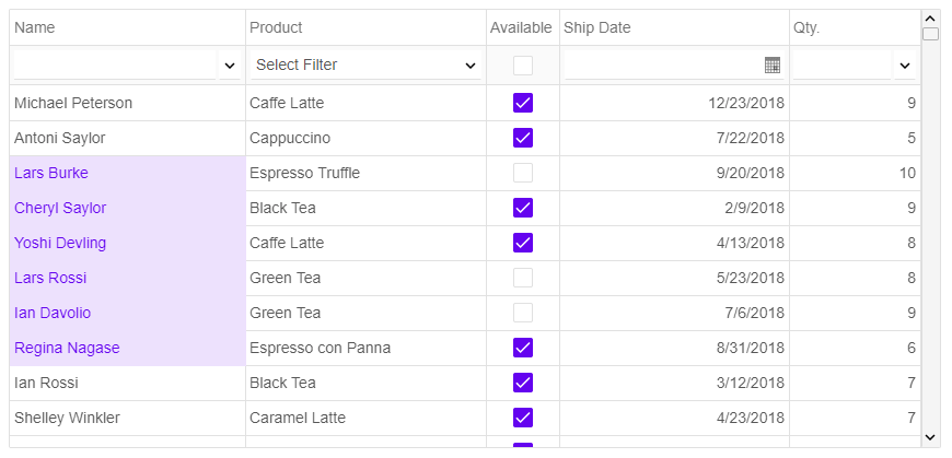
The filtering in the Blazor data grid component is extremely flexible. The grid offers standard filters with context menus and selection of filtering operators and conditions. The developer may also choose to use a filter row which will appear at the top of the grid's rows. Users may enter data in each column and the filtration will be done by matching the corresponding records in the grid. The filter menus are fully customizable. The Blazor grid also provides Excel-style filters with checkbox selection of the items in each grid column. Filtering can be achieved through API as well.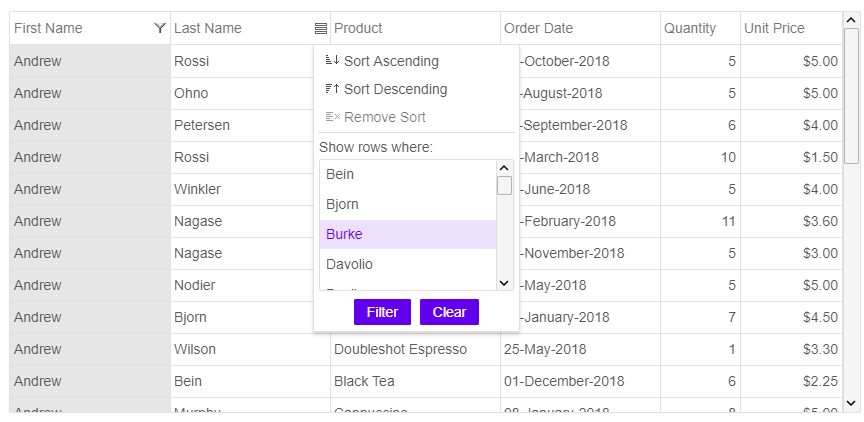
Grouping in Blazor Grid
The data in the Data Grid can be grouped and also you can turn on Group Aggregates. You can group by using the Grid Column's Menu or through its API and especially the groups property.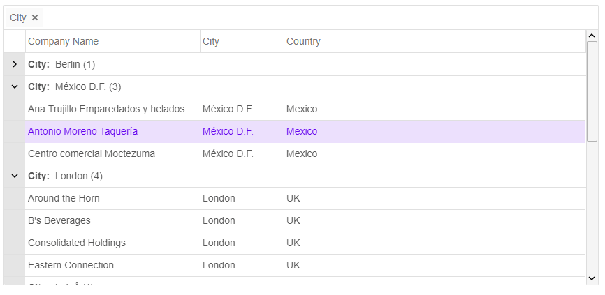
Editing in Blazor Grid
Our component supports multiple edit modes. Users can edit by cell, by row or through a popup. Edit validation is built-in as well. Some of the editors which can be used are TextBox, DateTimePicker, NumberInput, ComboBox, DropDownList, CheckBox.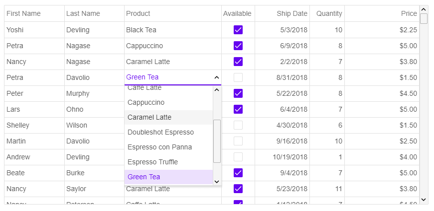
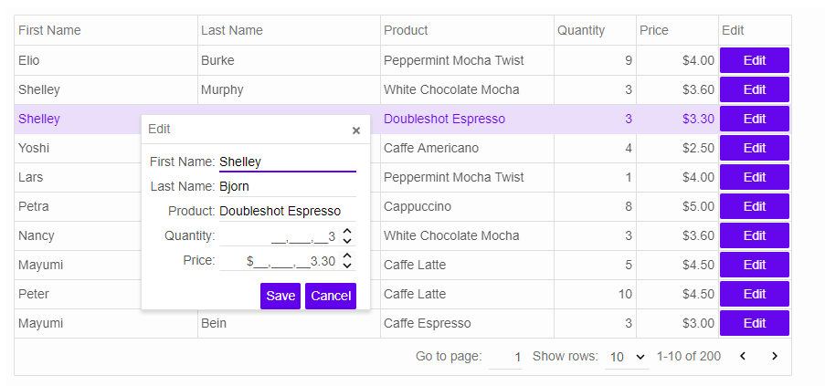 Editing can be validated by using custom validation functions. Developers may also add custom editors and customize the editing process through the API.
Adaptive Layout in Blazor Grid
For small screen size, the component can collapse its columns and render in adaptive mode where the last column is an action column that display "...". By clicking the "..." button, the view is changed and the clicked row's data is displayed.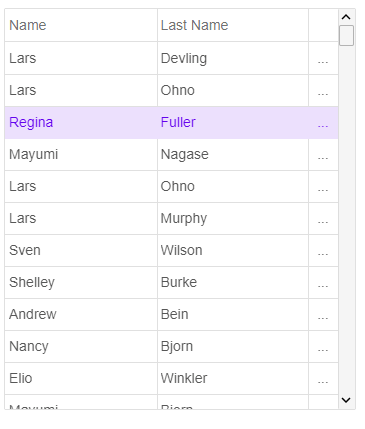
Paging in Blazor Grid
Paging allows you to display data sets in different pages. The paging feature is used for easier navigation and faster loading. Our Grid supports two built in paging layouts, but users may customize the rendereing through API, too.Columns and cells formatting in Blazor Grid
The Grid offers many options for columns and cells formatting. You can align the text in the cells left, right or center and have different bacckround colors. The columns can be shown or hidden and can be auto-sized. You can also have checkboxes, images and other widgets in the columns. In addition jQWidgets Grid for Microsoft Blazor enables complex features like column tooltips, foreign key, computed and pinned columns. You can also do reordering and resizing of the columns.Blazor Material Design
By using our Grid component, users can apply Material Design very easily. With the release of Microsoft Blazor and jQWidgets ver. 6.0.6, the usage of Blazor Material design has become easier as well. You can use the Material Design styled Grid by setting its "theme" property to one of the available material themes - material, material-purple and material-green. You can also create your material design theme, by editing jqx.material.css and replacing the colors there with your own.