Blazor Expander UI Component
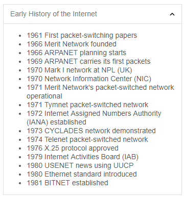
The Expander for Blazor is a simple and easy to use component which can show or hide an element. The component supports several built-in expand modes. It can be set up to show or hide an element after a click, double-click or mouse enter event on the expander’s header. You can change the toggle mode by setting the toggleMode property to 'dblclick', 'click' or 'none'. The data and the header of the Expander can be loaded on demand by invoking its setHeaderContent and setContent methods.
