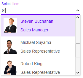
Blazor ComboBox UI Component
The ComboBox component for Blazor represents a list of selectable items displayed in a drop-down. Information can be input in the text box and a specific item can be searched for. The component comes with built-in auto-complete and supports pictures and images. The Multi Select feature enables the selection of multiple values in the ComboBox. The component can be bound to Local Data, XML, JSON, CSV, TSV and remote data using JSONP. You can configure the vertical and the horizontal alignment. You can also have cascading ComboBoxes where the data of the second one depend on the selected item of the first.
