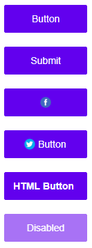
Blazor Buttons
The Button component for Blazor is an improved alternative to the standard button including new functionnality. It enables in addition theming and allows for the creation of consistent good looking User Interfaces. There are several types of buttons supported by the component. The ToggleButton represents a Button which can switch its state after a click. The RepeatButton raises the 'click' event repeatedly while pressed. The LinkButton is a Button created from an anchor element. The CheckBox button shows a check box allowing the end-user to select a true, false or indeterminate status. With the RadioButton, users can make choices among mutually exclusive, related options. The DropDownButton enables displaying any type of content in a popup.